
Framing your picture isn’t just about making it suitable to hang on the wall. It’s more about the memories that you make to enhance its appearance. Specific strategies help you do that, but not every frame can complement how your picture looks. You need to consider many factors for bespoke picture frames. That is what we are going to discuss in this article.
When it comes to framing, the prime considerations are shapes, colors, and designs. You need to have a good understanding of the combination of all these three to make your picture look way better than before. The article revolves around these three factors and how to combine them to get the best decoration. So, let’s start.
Combining the factors for bespoke framing
The Material
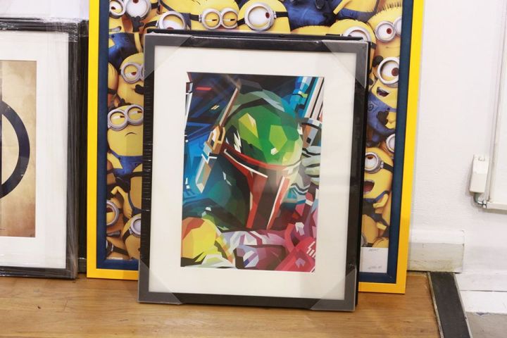
The most common materials in picture frames are wood and metal. The material doesn’t matter much if the design on it complements the content. However, if we talk about dimensions, then the material becomes very important. In traditional art, most pictures are black and white, and the frames are wooden.
In modern times, the frames need to match the color content of your picture. Wooden frames provide some nostalgia, while metal frames give a different luster to the image. The interior design has to match the shine that metal frames have an offer. If you want to gain more insights on metal versus wood, you can go through some pictures to differentiate between the two.
The Color
In most cases, the color and design go hand-in-hand. But if you consider the shade individually, there are several approaches. The first approach is to go with your gut feeling. Or you can go with the facts.
The first approach is to choose a color from your picture that stands out. This color should accentuate the whole appearance, and it can go on your picture frame. The shade should admit a sense of stability in the picture. It not only attracts the eye but also once someone notices closely, it comes out as a fascinating view. You can also opt for the matte color option.
If you want to go with a dramatic effect, you can go with some chaos. Sometimes, contrasting colors add excitement to your picture. If you’re going to implement this strategy, always use a metal frame. Wood might not do justice to the contrast.
And if you think neutral, and you don’t want to specify any color in the frame, it’s also a good idea. Provided, you know what a neutral color looks like.
The Design
The color of the frame has got a lot to do with the design. You also have to consider the picture content. For example, if your picture is too detailed, the design can also be the same and vice versa. The same design can lend a formal and tidy look and do the opposite. It all depends on the content of your picture and the color.
Again, you can go with a dramatic or neutral approach. We suggest not to go too overboard with the design as it can ruin the elegance in the picture. However, keep in mind that the design can make the image look a hundred times better. If you have not considered bespoke picture frames, take a look, and have an idea.
Finalizing the Frame
Once you combine all these three factors that form a picture frame, you know by looking at some examples. That’s why we suggest determining the genre of your picture first. Once you do that, you can take ideas and figure out individual factors and their combination quickly.
